features
Required Fields validation and Radio Button functionality
Wed, 22/04/2020 - 8:29pm — Site EditorA new Doculicious release tonight sees the addition of 2 much asked for features: Required Fields and Radio Buttons. I'll be adding some Documentation about these features very shortly, but will give a short explanation here of how they work.
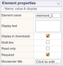
Required Fields
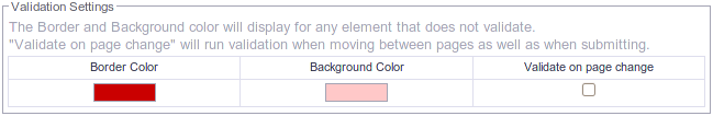
Each template also has settings for a background color and border color to display on an element when it does not validate. This visual feedback is important for your form users so that they know where the problem is on the page. We also indicate if there are required fields on other pages in the pop-up notification that occurs. Color settings are set once per template, and are located by clicking the Canvas Properties -> Style Options link.
When setting these colors, you'll notice a setting called "Validate on page change". This tells the template to validate the current page when the user attempts to change the page. Obviously this is only useful on multi-page template, but what it provides is similar to a wizard function, which only allows the current page to be left once all required fields are completed. If you leave this option unchecked, your form users can change the page without having completed all required fields. They still need to complete these fields before submitting the form, but can move around within the template at will. This is the default setting.
Radio Buttons
Radio buttons are a feature I've wanted to release for a little while, but decided to wait and do them in conjunction with the Required Field validation feature. I've utilised the current Toggle Box element to double as a radio button by providing a "Group Name" attribute which groups all checkboxes with the same name together. Any Toggle Box that is subsequently clicked will turn "on" and any other Toggle Box with the same group name that was previously "on" will be turned off.
On the web, Radio Buttons are usually round whereas our toggle boxes are by standard square. However, it's really easy to use the Display and Background images of the Toggle Box element to make a radio button that looks any way you like. Here's an example:
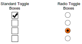
In the above image, each of the fields is a Toggle Box element. The ones on the left are the standard layout and the ones on the right use images for the button in the "off" and "on" state. All you need to do this is 2 images, the "on" state image is placed as the Display Image of the element, and the "Off" state image is used as the Background Image of the element. Make sure the images are of a good resolution, as the element size above is only 20px by 20px, which will not print nicely in a PDF (We used images 100px high by 100px wide in the above example. Doculicious will intelligently scale the images for quick viewing on the web, but will use the higher resolution image for the PDF, so that printing always looks good.)
You can check out an example template of the above checkboxes here.